Marguerite Paglierani

Image

Home

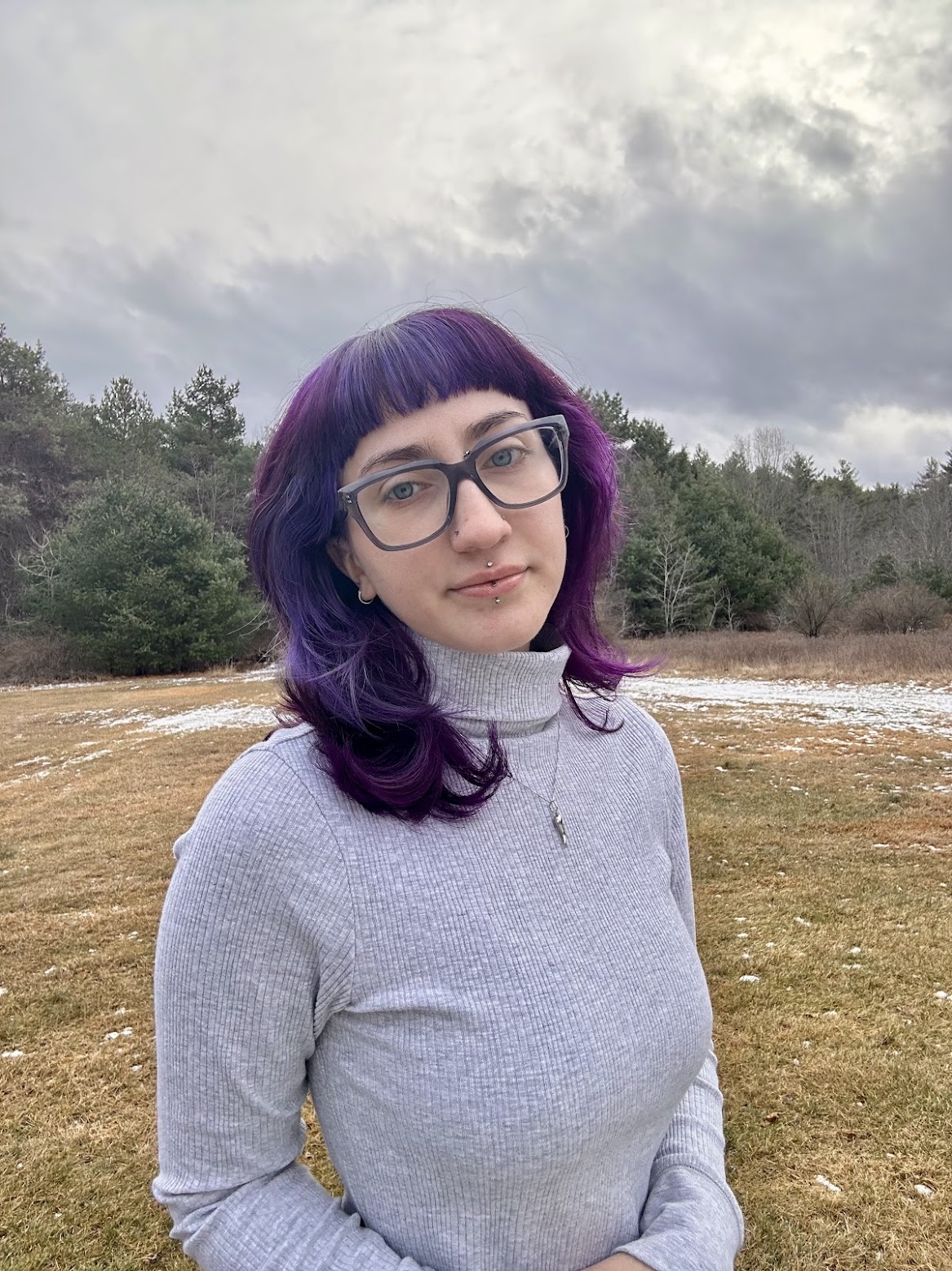
Hello, I am Marguerite Paglierani!


I earned my degree in English from the University of Massachusetts in Lowell, graduating in the Spring of 2024. Now, I am diving into a career in Marketing, using my Graphic Design and writing skills to create content that connects with audiences in meaningful ways.


When I’m not working on design, marketing, or writing, you’ll probably find me journaling, learning something new, or tinkering with coding languages. I thrive on creativity, whether it’s through storytelling, design, or exploring new skills.


This portfolio is a mix of my resume, graphic design projects, and original writing. If you’re curious about my coding work, check out my GitHub linked in the footer below!


Please, enjoy!


Resume

Graphic Design

Museum Redesign

For this project, we were asked to choose a museum and redesign their logo. I chose the Museum of Bad Art in Boston, whose logo is very outdated and does not transfer well onto branding materials.


I played with primary colors, creating a fun and bubbly symbol that overlaps in a playful way. The whole idea was to inject some energy and contemporary flair into their branding.


Then, I paired the symbol with a mix of Berlin Sans FB and Comic Sans MS for the wordmark. These fonts bring out a creative, diverse, and unconventional feel to the overall logo.


Typeface Specimen

This Typeface Specimen delves into the distinctive font family known as 'Sansita.' To me, Sansita exudes a spirited energy, akin to the refreshing sip of cold orange juice on a sunny day. It was this lively essence that I aimed to breathe into the project.


Embracing a vibrant palette dominated by shades of oranges and blues, I crafted unique graphics to accompany the exploration of this captivating font. The intention was to seamlessly intertwine visual appeal with insightful information, offering a delightful and immersive experience into the world of Sansita."


App Redesign

For this project, I redesigned Cash App with a focus on improving user experience and interactivity. My goal was to maintain the core elements that make Cash App stand out from other money transfer apps while introducing features that users find most valuable.


I created both light and dark mode versions, incorporating accent colors to highlight key areas and improve usability. Rather than a complete rebrand, I aimed to enhance the existing design by addressing common user concerns, including feedback from my classmates. The result is a refined, more intuitive interface that builds on Cash App’s strengths while making it even more user-friendly.


Creative Writing

Girls

Short Story

Passenger

Short Story